Orchidea

UUID: Orchidea
Last edited:
5 days ago 2024-11-10, 14:12
Last commit: [0f7ee027] Orchidea: Fix grouped-window-list-item-box (#831)

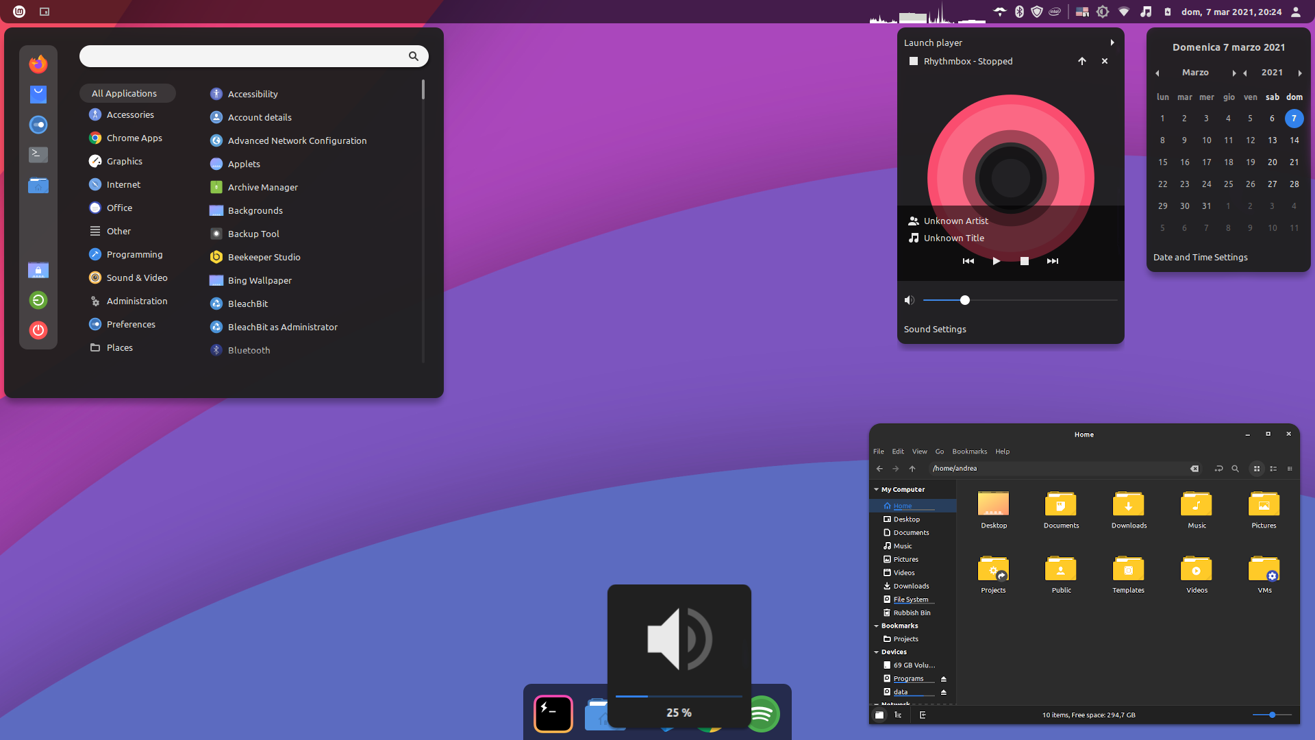
A dark theme inspired by vinceliuice's Orchis Theme (https://github.com/vinceliuice/Orchis-theme)

README

Close

Orchidea Theme

A theme inspired by vinceliuice's Orchis Theme (https://github.com/vinceliuice/Orchis-theme).

License

See LICENSE file.

Credits

To the original creator of Orchis Theme for the assets and some snippets of source code from the original theme.


Development section

Build

Theme (in all variants) can be built using the script build.js. Output files will be written in ./files folder.

node ./build.js

Development

Use following command to quickly compile sass files:

# Compile Orange Dark theme variant
sass src/cinnamon-orange-dark.scss files/Orchidea-orange-dark/cinnamon/cinnamon.css --no-source-map --watch
Log In To Comment!

18 Comments

Damir Nemcanin
Damir Nemcanin-4 days ago
Download it and decompress it in ~/.themes. see explanation on https://cinnamon-spices.linuxmint.com/themes/popular
String123YT
String123YT-5 days ago
as someone whos new to linux, how do i use it exactly?
jm2k7
jm2k7-2 months ago
Great desktop theme, but needs to improve the minimized apps indicator in the taskbar, it doesn't show it until you highlight with the mouse that you had an app running minimized.
cheyan Guo
cheyan Guo-10 months ago
I have modified the Orchidea theme and implemented a panel based dock function https://github.com/iamcheyan/OrchideaDock On the basis of the original theme, a panel based Dock has been implemented, which adapts to the appearance of the left, right, and bottom directions. To use this theme, simply set up a task panel with only icons to achieve Dock functionality, without the need for external Dock software such as Plank
PallavTank
PallavTank-11 months ago
How do I put on the theme ??
Dao Le Bao Minh
Dao Le Bao Minh-1 year ago
Can someone teach me how to shrink the bottom-side panel to fit the icons as in the screenshot?
urmst
urmst-1 year ago
Fabulous theme, cannot fault it. Thanks for keeping this up to date!
Christopher
Christopher -1 year ago
When displaying the hover preview thumbnails in the "Grouped Window List", it's very hard to read the black text since the semi-transparent overlay has been removed. Otherwise, a near perfect theme!
zarnocha
zarnocha-1 year ago
It's the best theme I've found so far. I'm using it and it's almost flawless. Almost because the only thing I can point out as a bad one is when something's running in the background, (i.e. an terminal) and it's minimized, when you hover over it's icon it's not centered. Other than that, it's great.
zarnocha
zarnocha-1 year ago
Also I would like to know how to get a panel like this on that attached screenshot.
richo
richo-1 year ago
esta muy bueno (it's very good)
joshualbird
joshualbird-2 years ago
This is incredible, thank you!
Shadowblitz16
Shadowblitz16-2 years ago
Can you make a version where the colors more consistent? It looks like you are using different colors/transparency for the different widgets and windows
angelotux
angelotux-3 years ago
can you also put round edges all over the window?
mfreeman72
mfreeman72-3 years ago
Cinnamon does not support rounded bottom edges, and they don't seem interested in adding any support for that feature.
Buhrdt
Buhrdt-3 years ago
I really enjoy this theme, simple, but has a nice modern feel.
Eren
Eren-3 years ago
Wonderful theme! What do you think about removing the borders around the taskbar and having it spawn the full width?
RedBearAK
RedBearAK-3 years ago
I was notified that this was available by the Spices Update applet I literally just installed yesterday. Seems I might have been the first one to download the theme via the Themes app. It's kind of amazing. I like it more than any of the other "popular" themes I've checked out so far (via the Themes app). Real "Big Sur" vibes, and I mean that as a compliment. But it's got one major issue for me, which is that I don't see a way to disable or reduce the main panel transparency. I auto-hide my main panel (at the top of the screen) for more vertical screen space on a laptop, so when it overlays on a busy background like a web browser with lots of tabs open, it is pretty useless when it's transparent. I searched around and found the "Transparent panels" extension, which has a toggle to completely disable transparency, and a drop-down that sets transparency to "Semi-transparent". This seems to work to make the top panel completely black when there is a window of some kind on the screen. But when the desktop is visible the panel is still semi-transparent. It kind of depends on the wallpaper but I've never really liked even semi-transparent panels. With the wallpaper always changing (via Variety) you never know how usable the semi-transparent panel will be. I wish I could choose to make it opaque at all times. At least semi-transparent is better than the default "With shadow" option, but the "Transparent panels" extension doesn't provide a flat-out "No transparency" option. Anyway, other than the fact that a pop-up (or pop-down in my case) panel is virtually unreadable on a busy screen, this theme is really impressive. The Cinnamon menu looks fantastic. Well, actually the theme only seems to be having an influence on the "desktop" parts of Cinnamon. Panel, menu, right-click menus from the panel. The calendar pop-up dialog. The volume/brightness OSDs. If it's supposed to also have options for window borders, icons and controls, those options are not appearing for me in the Themes app. Again, I just installed this via the Add-Remove tab in the built-in Themes app in Cinnamon. Don't know if there's a better way to do it.