SimpleDock

UUID: SimpleDock
Last edited:
4 months ago 2024-07-03, 13:09
Last commit: [deb84404] Remove unnecessary permissions and update scripts (#813)

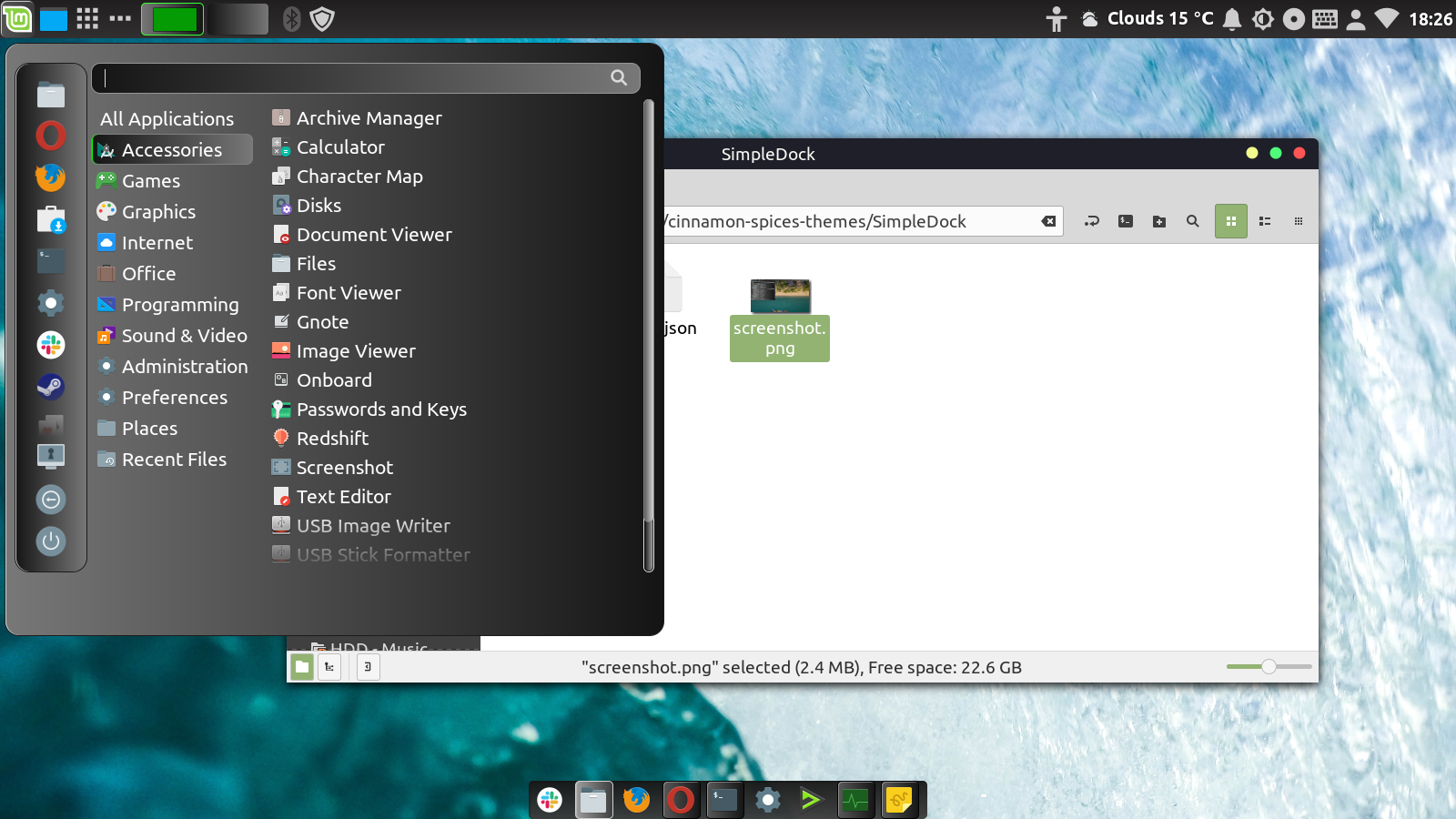
Simple centre zone dark dock to left, right and bottom, with adjacent right and left zones transparent. Derived from Graphite Zero (see credits there), with reduced rounding and menu border. Suggest setting the 'dock' panel to autohide or intelligent hide if you want the 'dock' not to constrain the space for windows. Please note that this does not bring all the functionality that a full blown dock would, it is still a standard panel
Log In To Comment!

5 Comments

LinuxOnTheDesktop
LinuxOnTheDesktop-4 years ago
The theme seems to render symbolic icons in a colour that is wrong for their background colour - at least with the launcher applet. Screenshot: https://i.postimg.cc/DwNdYPCb/image.png
GNU_Linux_User
GNU_Linux_User-5 years ago
Thanks for continuing to work on this. I am suprised the dock does not seem to have had more uptake.
GNU_Linux_User
GNU_Linux_User-5 years ago
Screenshot illustrating the problem I mentioned in my last post: https://i.postimg.cc/hvPymhSR/image.png
GNU_Linux_User
GNU_Linux_User-5 years ago
It seems that the transparent parts of the panel - to the left and right of the 'dock' - cannot be clicked through. So, to use the image above as an illustration, were there a button I wished to click that was just to the right of the System Monitor icon, then I would be unable to click it. Sadly, this is a fairly serious problem.
GNU_Linux_User
GNU_Linux_User-5 years ago
Some rough edges (still), but really very nice and a great asset to Cinnamon.