Eleganse-dark

UUID: Eleganse-dark
Last edited:
7 years ago 2017-09-25, 01:37
Last commit: [47c82c6b] Eleganse-dark: info.json, screenshot.png update, README.md creation (#257)

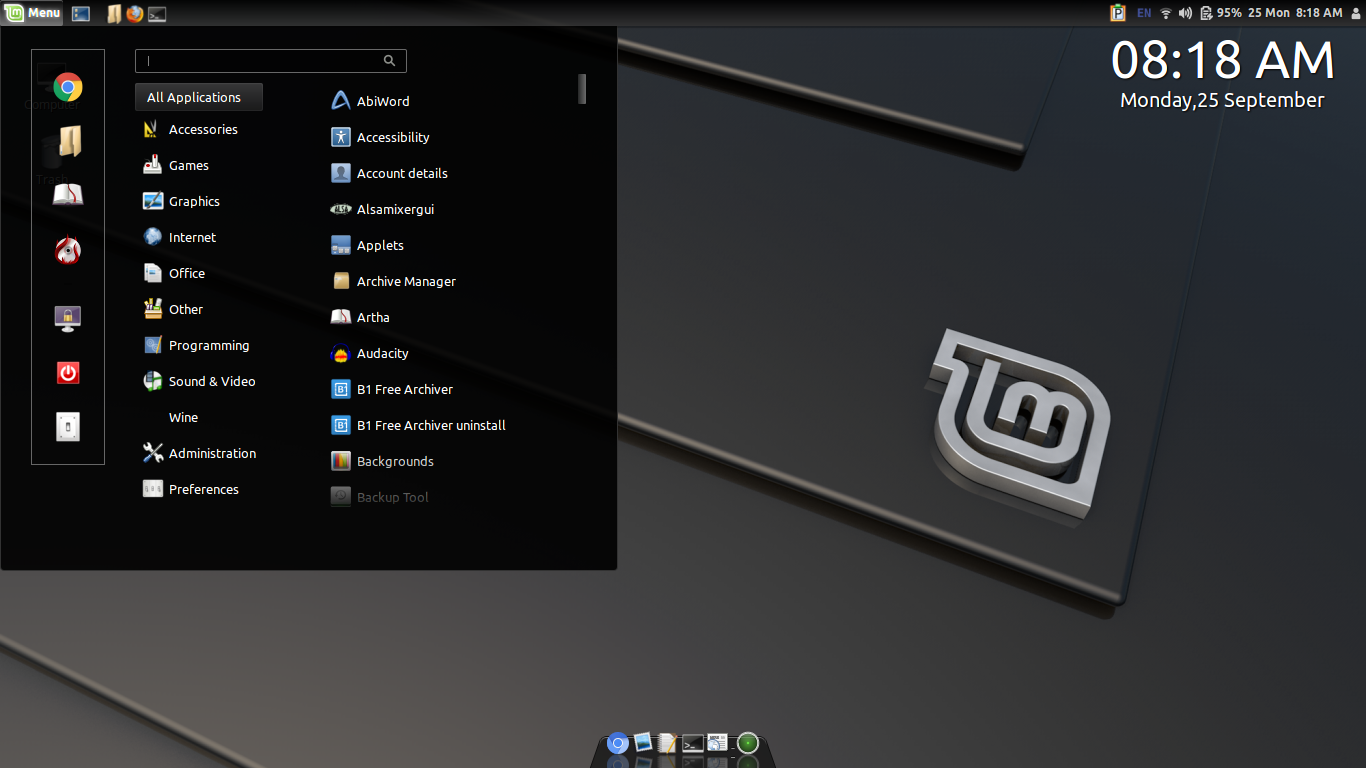
A dark theme with elegant appeal

README

Close

A dark theme originally based on 'Eleganse' theme. But now progressing independently.

Icon theme used in the screenshot is "nuoveXT2"
Log In To Comment!

11 Comments

richo
richo-2 years ago
me gusta
watzki78
watzki78-3 years ago
look is good but this one u can not deinstall komplete. U have to reinstall Mint to drop this bad. Windows stay framed. Bad work.
cloudscream
cloudscream-5 years ago
Cool, dark, and transparent. Perfect.
navyguns
navyguns-5 years ago
This is my go-to theme on all my Cinnamon desktop installs. Would be nice if the Windows borders and Controls options were present in the theme. Thanks for your efforts.
Leandro Martinez
Leandro Martinez-6 years ago
This is GREAT, at last a dark environment, props to the devs! I just have a question, how to enable the OS X-like menu bar at the bottom?
praveenp
praveenp-6 years ago
That is a dock application named docky. You can install it from software manager.
hjk mkl
hjk mkl-6 years ago
Dark theme but not elegant. Not at all.
Stephan Helas
Stephan Helas-7 years ago
Hi, the switcher style icons is not readable on dark backgrounds (like terminals), because the rectangle is also dark. can you change that? http://picpaste.com/IMG_1174-5HfxaP0K.JPG second question: can you make the active window more obvious (like win95, blue for active, grey for inactive)
praveenp
praveenp-7 years ago
A light border added and probably update soon (https://github.com/linuxmint/cinnamon-spices-themes/pull/216). Hope this will fix the switcher issue. Being less vivid is appreciated in this theme (as well as eleganse theme and original gnome 3 elegance theme), It would be okay to follow that design philosophy for now.
Sam
Sam-7 years ago
what's that dock?
praveenp
praveenp-7 years ago
Docky